Beer got the branding. Water got a plastic bottle. That has been the deal at the bottom of the cooler forever, and JUG canned water is the Canadian brand that set out to fix it: reverse osmosis filtered still water in a 473 mL can, launched in October 2025 by Brock James. Their own line for it: "Cold. Crisp. Canadian."
Brock helped build brands at Cottage Springs and Ace Hill, and before that at Molson Coors Canada. So he knows what a cooler looks like at 11pm, who in it isn't drinking, and that the can leaves while the hat stays. That last part is why he sent us a deck.
The brief
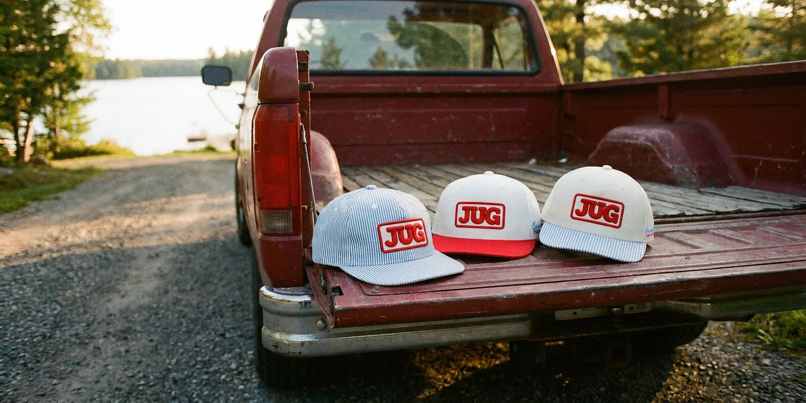
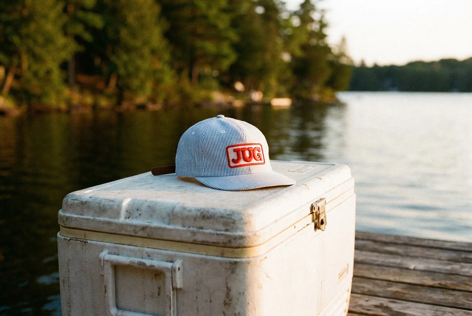
The deck landed in September 2025, titled Merch Direction. Brock already knew what he wanted, which is the best kind of client to have. Three tiers, from a plain everyday cap up to a conductor-style blue stripe with a leather strap. The references were vintage delivery-truck Canadiana: hand-painted signs, greasy spoons, dive bars, boat rides.
Read that list again. That's a hat brief. The job was to build the three tiers so they looked like JUG, not like a logo dropped on a blank.
The build
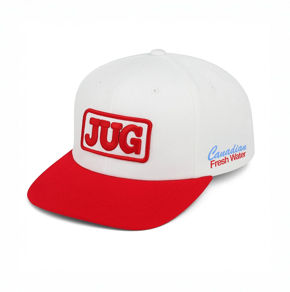
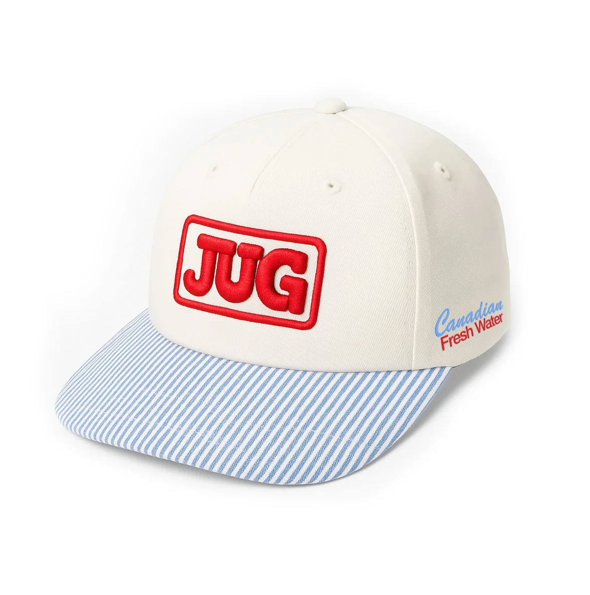
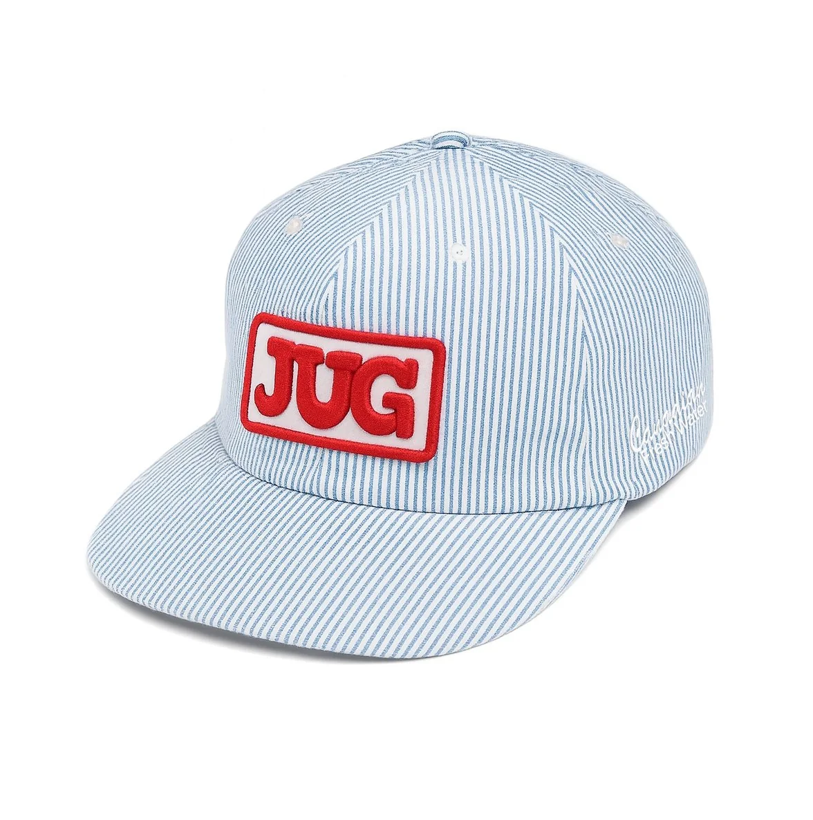
All three run on the same construction, so the tiers read as a family rather than three separate products:
- Semi-structured 5-panel cap, cotton twill, flat visor.
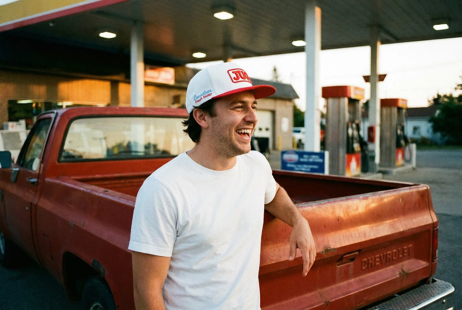
- Front: a 3-inch patch in 3D puff embroidery, the raised kind, with a merrowed edge in JUG red.
- Left side: 2.5-inch flat embroidery of the "Canadian Fresh Water" script.
- Back: a woven Canadian flag tag on the closure.
- Inside the front panel: mesh, because July.
The design decisions
Patch, not flat embroidery, on the front. Flat embroidery on a white crown reads like a logo. A raised patch with a red border reads like the badge on a delivery uniform. On a brand that dresses like a delivery truck, that is the whole difference.
Hickory stripe. The narrow blue and white stripe off old railroad workwear. It's the fabric that carries the delivery story on its own, before the patch even lands.
The red under-brim. The one flash of colour you only catch when someone looks up, or when the hat lands on the dash.
A woven flag tag, not a printed one. The "proudly Canadian" line from jug.ca, done in thread on the closure. Small, and the kind of detail that gets noticed second.
The timeline
Deck in September 2025. Order in October. All three hats live on jug.ca by late November, worked up in Mississauga from Brock's brief the same way every hat here runs: brief, mockups, production, box at your door.
The result
All three hats sell on jug.ca, one size fits all, alongside water that is now in Circle K stores across Ontario and poured at 750-plus bars, restaurants, golf courses and hotels. A generic promo hat says we had budget. A JUG hat says we have taste, and taste gets worn on the back nine, at the dock, on a dive bar patio in September.
We built the same way for The KEE to Bala's summer collection: hats people wear first, branding second. Same bar we hold our own hats to, no lower.
The can leaves. The hat stays.